
watercolor & gouache class section 3:
understanding
value and drawing
Section 3 Part 1:
introducing value
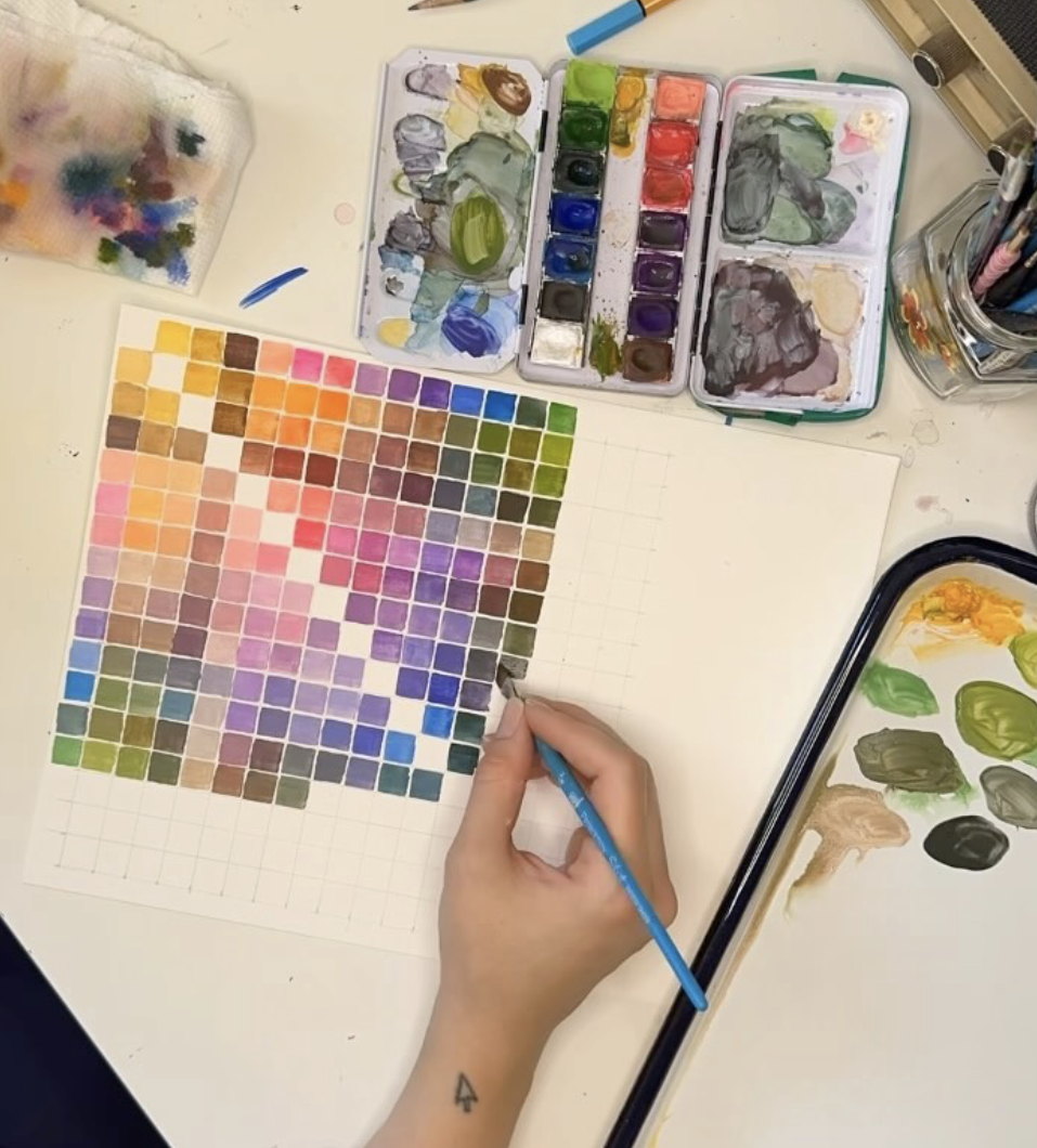
In composition and through our thumbnails, we learned to find interesting shapes. Now we will think about the value of those shapes, which ones are light, which shapes land in the middle, and which ones are dark. This is super important in making good paintings!
Section 3 Part 2:
drawing systems
Always struggled with drawing “realistically?” Me too! There are loads of systems out there for learning how to get your forms accurate without struggling. I’ll share those systems and talk about their history before we try one out for ourselves.
Section 3 Part 3:
setting up the grid
Now we will put the grid method into practice using an analog system and a print out of our photo. Would you prefer to do this digitally? Refer to Part 5 instead where I walk you through using a template in Keynote.
Section 3 Part 4:
creating our drawing
This is a lesson in both realism and abstraction, so be patient with yourself as you try it. In this video you can watch me simplify each form one box at a time, looking for the general shapes (a thing we practiced with our thumbnails!)
By obscuring the rest of the image and working one grid box at a time, we can accurately put forms in their homes and override our brain wanting to course correct.
Section 3 Part 5:
gridding with keynote
This optional demo walks you through gridding your photo using the free Mac app, Keynote. Here is the template for you to use!
Section 3 Part 6:
gridding with keynote
This optional demo shows you the grid method once more, with a lot more detail, using keynote and an image with low contrast in a lot of the shape areas. This is a slightly more intermediate demo!
Section 3 Part 7:
making our own black
While a tube of Black or Payne’s Grey is great to have in our palette, learning to mix your own is incredible and gives you more control of temperature in your darkest painting areas. Here I demo mixing Ultramarine and Burnt Umber.
You can substitute any blue and brown combo and get a similar effect, but this will be the most neutral. Remember that unlike Ultramarine, Phthalo’s are dyes, and will be far more staining and powerful than other pigments. I love to combine Phthalo Green and Napthol Red for a really gorgeous deep, luminous green black.
STUCK ON SOMETHING?
If you are feeling stuck, frustrated, or longing for feedback, you can always book a tutoring session with me. We can work together for one session or over the course of a few months depending on your needs!